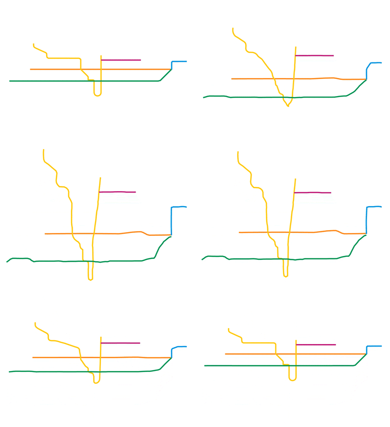
The Newest TTC Map: On Paper vs. Reality
The newest Toronto Transit Commission (TTC) map is distorted - and so are most transit maps. Network diagrams usually replace traditional maps when navigating people through a system, which favours connectivity over geographic accuracy.
I was always curious, when looking up at the TTC's subway map, what it actually looked like. I ended up recreating it to scale one day and was surprised by the response.
Since the TTC is updating the map, I thought I would take another look at it, but with some analysis this time. Using Bernhard Jenny's MapAnalyst I was able to create a deformation grid over top of the subway map.
This tool allows you to see which points are actually experiencing the most deformation. The size of each circle represents its local inaccuracy - larger circles indicate greater inaccuracy.
Areas where the grid is more tightly packed mean that points are further from their neighbours. Wide grid spacing (as seen in the downtown loop) means the points are actually more confined when looking at the map to scale.
The newest Vaughn Metropolitan Centre station appears to be the most skewed. This is likely due to the height of the map and just how far north the new station is.
The Sheppard Line is also heavily distorted as it is much further away from the Eglinton LRT line than the map displays. In fact, the LRT is closer to the Bloor/Danforth Line, but the TTC map makes it seem like the opposite is true.
The Scarborough RT also creates one of the most clustered parts of the deformation grid. The transit map makes Lawrence East and Ellesmere appear very close together, when in reality they are distanced similar to Lawrence and York Mills station.
So the next time your buddy asks you to meet up at Pioneer Village station, remember the distortion grid and plan your trip accordingly.


